XR Design Trends: Let’s see what awaits us in 2021. It may be disappointing for some, but it’s realistic: this year, we shouldn’t expect hardware revolutions in the AR and VR market. It will be a year of transition. However, it’s a great opportunity to focus on the design of immersive apps. To refine best practices that lead to more immersive and, above all, more usable experiences, where virtual and augmented reality are used to improve processes and not just to impress.
Certainly, we can affirm that between 2020 and 2021, in terms of XR Design Trends, the cards on the table have completely changed.
The AR and VR Challenge: Technology or Design?
2020 was a completely atypical year. Restrictions on movement imposed to cope with the pandemic disrupted the way people interacted, both on a personal and business level.
Suddenly, online video conferencing meetings went from being an exception to the rule to becoming the norm in every aspect of life. Whether it was discussing with colleagues, organizing work with superiors, contacting partners and clients, or even “seeing” relatives and friends through the screen filter.
In many ways, human relationships became dematerialized, and even those less accustomed to technology had to adapt to the new reality, stimulating the development of solutions to bridge the distance without reducing productivity. Applications like Zoom experienced rapid, almost explosive growth, as did the usage of apps like Teams and Slack, which were enhanced to support the new needs.
While office work continued with few major issues, aside from initial difficulties in adjusting, those who relied on fairs and events faced an unprecedented crisis. With mobility eliminated and the impossibility of organizing in-person meetings, the only solution was to transfer them to a digital dimension, with varying results objectively.
So, what were the 2020 trends in terms of XR Design Trends? Some settled for using traditional streaming platforms, while others tried to go bigger, attempting to replicate the fair experience on the small screen. Similar to a video game, these platforms allowed free movement through exhibition areas, stopping at various booths, consulting documents, and sometimes interacting with avatars giving product presentations.
However, the results were not satisfying in these cases. Many of these platforms were unintuitive, cumbersome to use, and rather slow. Instead of immersing people in the event atmosphere, they alienated them.
Is the technology not ready then? Absolutely not. It’s all a matter of design.
XR Design Trends: Greater Focus on Experience, Not Amazement
How is it possible that video games have been able to handle virtual worlds with hundreds, sometimes thousands of people simultaneously for years, while more professional applications struggle to replicate an adequate experience? The answer is simple: it’s purely a matter of design.
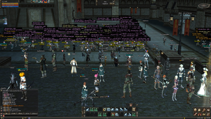
Developers of virtual worlds for video games have had years of experience to fine-tune their interfaces, to adapt them to the users’ needs. On the contrary, many of the platforms that were used as business tools during the lockdowns are still immature. Understandably so: no one expected the Covid pandemic, and as a result, everything was developed quickly, without the opportunity to think through the details that make a difference. Not the visual impact, but the usability.
A simple example is that of information. If, in a simulated world, when you need to consult a document, it is presented as a window within that world, readability suffers, for example. Similarly, to obtain easily searchable information on a website, one has to make the gesture of picking up a brochure by clicking on a virtual object with the mouse.
These experiences may be enjoyed the first time, but by the third use, they reveal all their limitations and tend to frustrate rather than fascinate. And no, a virtual reality headset cannot solve the problem, as it is not to be found in the display but in interactivity.
Those who use video games quickly realize how much more advanced gaming worlds are and how they influence XR Design Trends. However, it is also worth noting that part of the credit goes to the user base, which is technologically more advanced. Those who develop metaverses for the business sector often tend to oscillate between two extremes: on one hand, there are those who create virtual experiences trying to mimic games, forgetting that users should not be entertained but should work in these environments, forcing people to download clients that can weigh up to 1 GB.
On the other hand, there are platforms created by individuals who are not familiar with this type of technology, and in the end, they do not create virtual worlds but rather simple websites with links, which have nothing to do with immersion.
Neither of these two approaches is conceptually wrong, but one must find the best formula based on business needs, always keeping simplicity in mind, which does not mean banality but essentiality and efficiency.
An example is that of virtual showrooms (we have discussed here what Frette has done) that leverage the concept of interactive 360° videos instead of simulating virtual worlds.
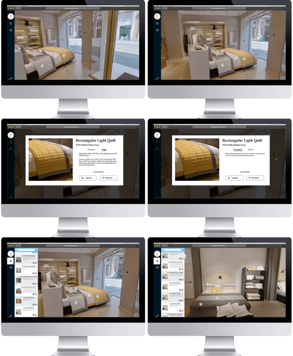
A simple approach, both for the developer and the user, which proves to be particularly effective, especially in those cases (the majority) where specific devices for exploring virtual environments are not expected: VR headsets today represent a niche market and are not widely adopted, besides having some significant technical limitations (starting with the motion sickness effect they can cause), and that is why most virtual experiences must be designed to be viewed on common screens.
The limitations of virtual and augmented reality interfaces
Current VR headsets have come a long way since the early prototypes of Oculus Rift, which sparked the “trend” a few years ago. Considering the price at which they are sold, which is not low, they offer truly remarkable results. However, developers still need to learn how to overcome the inherent limitations of these technologies, starting with motion sickness, and the sense of nausea that many experience when wearing headsets. This limitation can be addressed by carefully considering the design of the application.
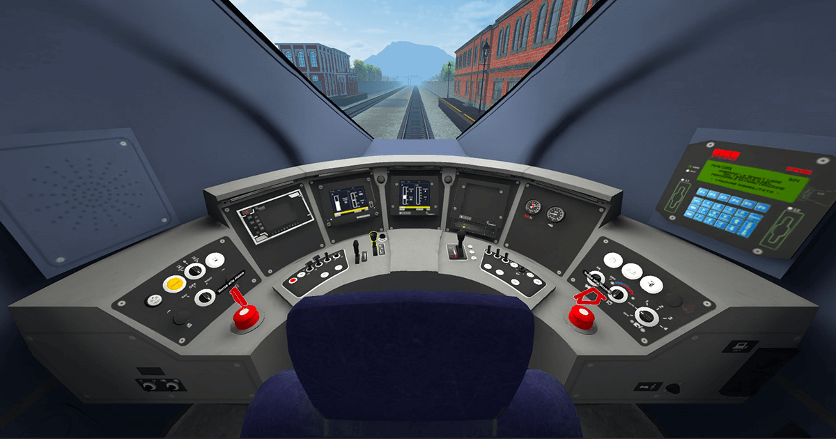
Let’s look at an application we developed for Trenitalia as an example. The user finds themselves inside the control cabin of the Frecciarossa train, in motion, and although it may seem like a common experience, we had to work on a series of technical measures to limit issues such as motion sickness. We addressed the problem by manipulating the point of view and increasing the frame of reference. In practice, we made users “sit” lower than they would in reality, thereby reducing the area in motion to some extent and alleviating the unpleasant sensation of nausea.
This also applies to augmented reality, which has two variations today: smartphone-based AR, which is great for tourists and gamers but not well-suited for business, and smart glasses-based AR. In the smart glasses market, there is a lot of excitement, and many companies are developing devices primarily for remote assistance and maintenance of complex products. Think about the maintenance of an airplane or a train, where having hands-free operation while working and simultaneously checking checklists and technical diagrams can greatly increase productivity.
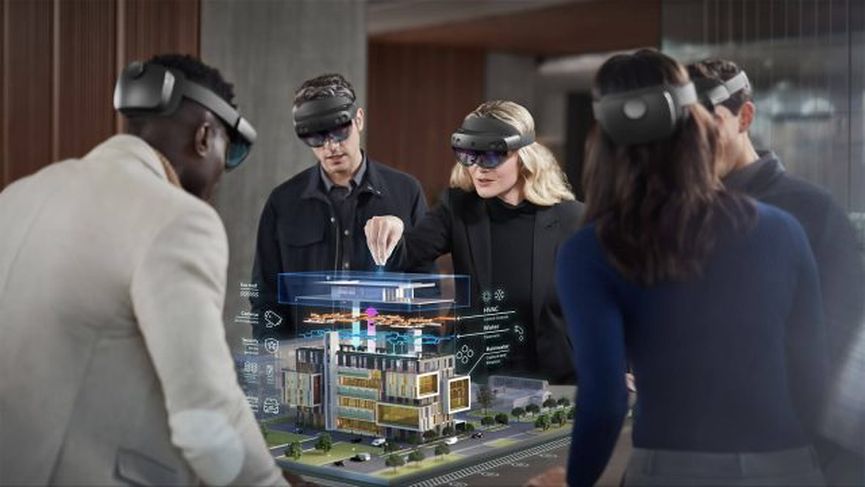
Certainly, from a technological perspective, Microsoft’s HoloLens 2 is the most advanced on the market and has the advantage of integrating into Microsoft’s ever-evolving ecosystem, leveraging the potential of Azure cloud. However, those expecting mass adoption in the coming months will be disappointed. We’re talking about a product that still carries a hefty price tag (over 3,000 euros), making it viable only in very specific domains where budget is not a concern.
That’s not its only drawback: it’s heavy, making it challenging to use for extended periods. However, this is a relative limitation since the batteries currently only last a couple of hours. Additionally, due to its design, developers must adapt applications to their constraints, starting with a very limited field of view, which forces application creators to restrict the area in which augmented reality elements are placed.
Customer expectations versus the reality of the situation.
Many times, the best ideas fail to consider the actual usage of the application. In the wake of the success of Pokémon Go, which displays Nintendo characters on the screen of a mobile device as if they were in front of us, numerous applications have emerged, often for marketing purposes. While the idea may be excellent, the execution often falls short. For example, showcasing a car in augmented reality might be an effective advertising technique, but if the virtual car appears at full scale instead of being anchored to the table in the room, the experience is inevitably ruined.
The reason is simple to understand: we are looking at these enormous objects through the small screen of a smartphone. It may seem trivial, but we have often witnessed such design errors, just as with fundamentally immature virtual fair experiences.
In many cases, the problem lies in the excessive ambition of those proposing the idea and their attempt to realize it without considering technological limitations. This is where developers come into play. They should not just be mere executors but rather consultants to their clients, guiding them in search of a solution that meets their needs and is also functional.
Clients also need to make an effort to have the right mindset. Certain ideas, although fascinating, may not be feasible due to technological or budgetary reasons. It is necessary to accept certain compromises when working on innovative projects.
Certainly, those commissioning work should aim high but also trust their technology consultants, whose objective is to help materialize their vision while staying within the limits imposed by the available tools and technologies.
Clients seeking support from a developer may not necessarily have specific expertise, and they are not expected to. Everyone would love to participate in a virtual event by moving around within it using a VR headset and “actually” meeting other participants—it would be splendid. However, the reality sets in when considering the cost of the headsets and the infrastructure required to handle such complexity, which can be prohibitive. Consequently, there is often an attempt to recreate the intended experience by lowering expectations, with results that are not always satisfactory.
Our response?
Working together – client companies, designers, and developers. Safeguarding the idea while keeping the objectives in mind and finding smart, practical solutions in terms of user experience, validated by professionals with specific XR Design expertise.
This approach is far more productive than the utopia of futuristic projects that fall short in terms of user experience.
To reiterate the aforementioned points, this year it is important to focus on experiences rather than simply trying to impress participants when it comes to XR Design Trends.


